
I’m a firm believer that an edge can be created through simple data analysis. I further believe that the rarer the data the better the edge. You can also take common data and create different or unique ways of looking at it. As an example, here’s a different way to approach widely available put & call data. The chart below is a ratio between the number of stocks that have more put volume than call volume divided by the number of stocks that have more call volume than put volume.
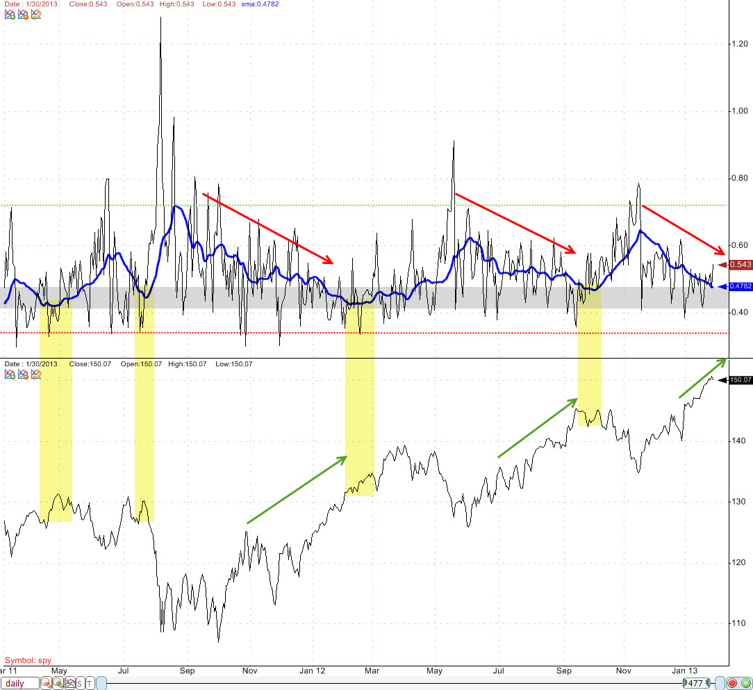
A couple different items to point out about this data. The first is that there is a 20-day SMA (blue line) to smooth out the signal. Notice how when that signal enters the area highlighted in gray that the market begins to form a topping pattern in price. The signal just entered that area yesterday. One other item is that the daily signal (black line) typically tops out around 70 and signals a bottom. After that happens the signal makes lower highs (red arrows) as price makes higher highs (green arrows) until the 20-day SMA begins to suggest a topping pattern.