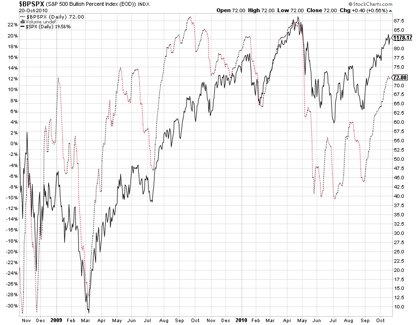
Just a quick post to share something that’s been puzzling me. I’m not a point and figure user but I do look at the Bullish Percent Index (BPI) charts from time to time. Below are the SPX and NDX charts in which I’ve included the respective BPI data. The main thing that sticks out to me is that from the March 2009 lows the BPI was, for the most part, above the index itself. This makes sense since the point and figure charts are giving buy signals thus buying ensues and higher highs are made.
However, ever since the April 2010 highs the BPI has been trailing the indices which would suggest that fewer buy signals are firing. Yet the indices continue to climb towards the April highs. Maybe it has to do with an extremely oversold market which existed in the post financial crisis so nearly every component was giving buy signals or maybe not. Thoughts?


Not necessary for correlation between BP & Index price action. Apples/Oranges
Also, try BPNYSE, ’cause the SPX & Especially NDX are weighted indexes (AAPL @ 17pct NDX)
Thank you. Appreciate the feedback and direction. Looking at the $BPNYA I still see the lagging since Early September when looking at SPY and QQQQ.